
Struggling to get interviews?
Choosing the right font ensures that your resume is professional, easy to read, and aligned with your industry’s expectations. We explain how to choose a font and list 10 of our favorites.
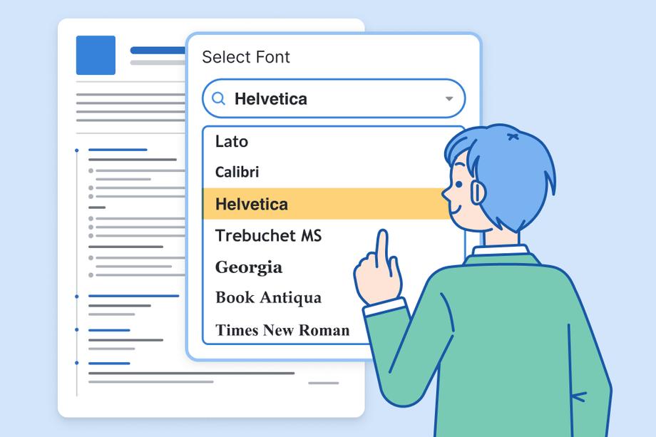
Not sure what font to use on your resume? It’s best not to overthink it. The best font is usually a simple sans serif font like Arial.
Geoffrey Scott, our hiring manager and Certified Professional Resume Writer (CPRW) with 9+ years of experience, agrees:
I like to see fonts that are easy to read like Arial since I’m on a computer all day and it’s something I’m familiar with. Essentially, fonts shouldn’t distract me from the content of your resume, so as long as I don’t think “what’s going on with this resume’s font?” then your choice of font and font size was good.
Geoffrey Scott, Senior Hiring Manager and CPRW
The best font for your resume is the one that nobody notices. So, use any clear, plain font like Arial, Calibri, Cambria, etc. Just stay away from goofy fonts like Comic Sans or Papyrus.
How to choose the best font for your resume
Choose a font that looks good to you and is clearly readable when you save your resume as a .pdf.
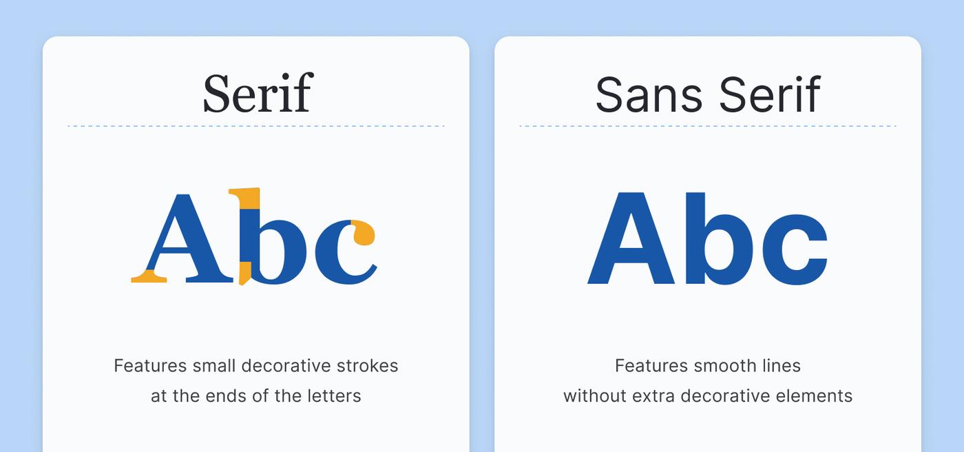
Fonts fall into two general categories: serif and sans serif.
Serif fonts have decorative pointy corners and accented edges on letters, called serifs. Serif fonts have a classy, traditional feel and are easy to read on paper.
Sans serif fonts don’t have these. (Sans means “without” in French, so “without serifs”.) Sans serif fonts look clean and modern, and are easier to read on screens, especially at lower resolutions.
There’s a lot of misleading information out there that says you have to use certain fonts for certain industries, but that’s not correct. You can use a serif font or a sans serif font on a resume for any industry.
However, sans serif fonts are easier for computers to scan, which is important when you’re writing an ATS-friendly resume.
Popular resume fonts
Here are some of the most popular fonts you can use on your resume:
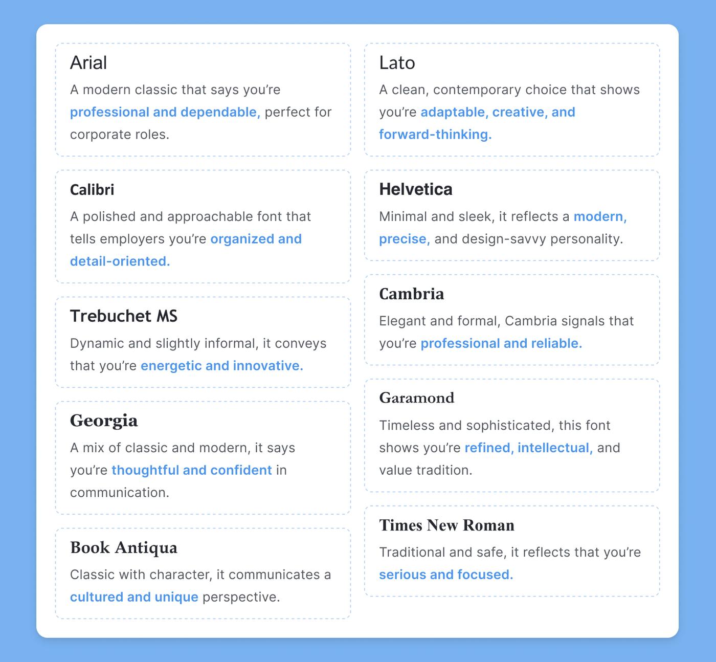
1. Arial

Arial is a popular sans-serif font that’s easy to read. If you want a clean, no-nonsense font that can be displayed on any device, look no further.
2. Lato

Lato was designed to be “serious but friendly,” according to its designer. It’s a clear sans serif font with slight differences from Arial that will make it seem fresher to readers.
3. Calibri

Calibri is the default font in Microsoft Office and it has a little more character than Arial. It’s also slightly narrower, especially in upper case, which may allow you to fit more letters on a single line.
4. Helvetica

Helvetica is a classic (dare we say famous?) sans-serif font widely used in logos and signs worldwide. Its clean and timeless design also makes it a top choice for resumes.
5. Trebuchet MS

Designed for on-screen reading, Trebuchet MS is an excellent sans-serif font that features a hint of creativity (just look at that lowercase g) without sacrificing clarity.
6. Cambria

Cambria is a serif font known for its even proportions that make it easy to read even at smaller sizes. It’s a classy choice if you want your resume to have a more academic feel.
7. Georgia

Georgia is another serif font that works well on digital displays because it’s easy to read even in low resolution. It was commissioned by Microsoft in 1993 and is also widely used for digital content and is known for its readability.
8. Garamond

Based on Roman type, Garamond is a lighter serif font that brings a bit of formality to your resume. It’s also a thinner font, so it’s great for saving space if you need to fit a lot of information on your resume.
9. Book Antiqua
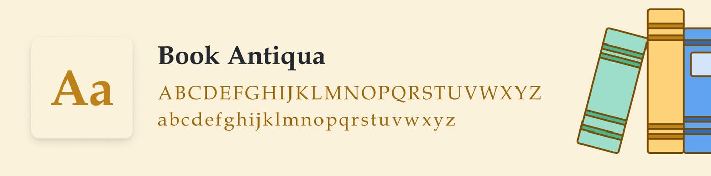
Book Antiqua is another popular font choice if you prefer the look of serifs. It’s one of the more elegant fonts on this list, and is perfect for fields like law and academia.
10. Times New Roman

Times New Roman is a classic serif font that was created in 1931 for The Times newspaper and has since become one of the most popular fonts in the world.
However, it has fallen out of favor in recent years and many people think it gives resumes a dated feel.
How to choose a font size
The standard font sizes for resumes are:
- Header (your name): 28-35pt
- Section headers: 14-16pt
- Body content: 10-12pt
Readability is the most important part of choosing your resume font size. So while 10–12 is the standard size for most fonts, some fonts might need to be set at a slightly smaller or larger size.
To find a perfect balance:
- Pick a font style
- Adjust the font size until your resume appears filled (but not stuffed) with text
- Ask someone else to read your resume to see if the text looks too big or small
Fonts vary in width and spacing, so some of them will take up more space on your resume, even at the same font size. To help you, we’ve included our recommended font size for the 10 best resume fonts on this list.
Ideal font sizes for your resume body content
| Font | Size |
|---|---|
| Arial | 10.5-11 |
| Lato | 10.5-11 |
| Calibri | 11-12 |
| Helvetica | 10.5-11 |
| Trebuchet MS | 10-11 |
| Cambria | 11-12 |
| Georgia | 10.5-11 |
| Garamond | 12-12.5 |
| Book Antiqua | 10.5-11.5 |
| Times New Roman | 11-12 |
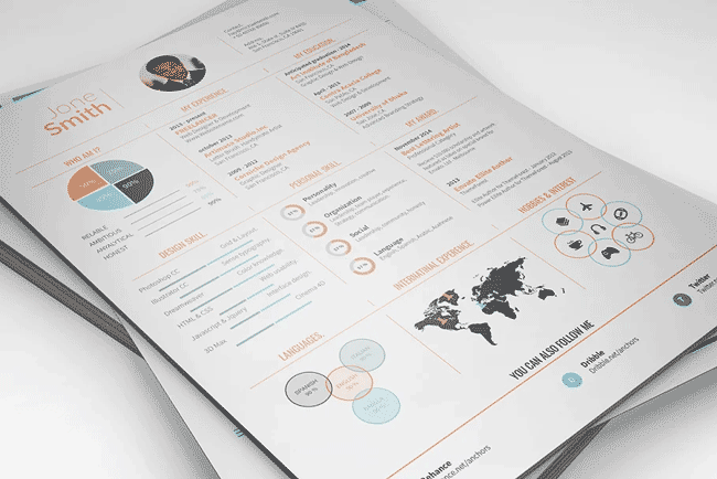
Pair fonts to make your resume stand out
One of the best ways to make your resume stand out is to use multiple complementary fonts so you get some variation between the headers and content.
You don’t need to be a design expert to choose a great font pairing. Just use a high-quality resume template with pre-selected fonts. This makes it easy to create a sharp-looking resume that’s sure to leave a positive first impression on hiring managers.
Below, we’ve selected a few examples of resume templates that use stylish font pairings:
1. Lora and Nunito Sans
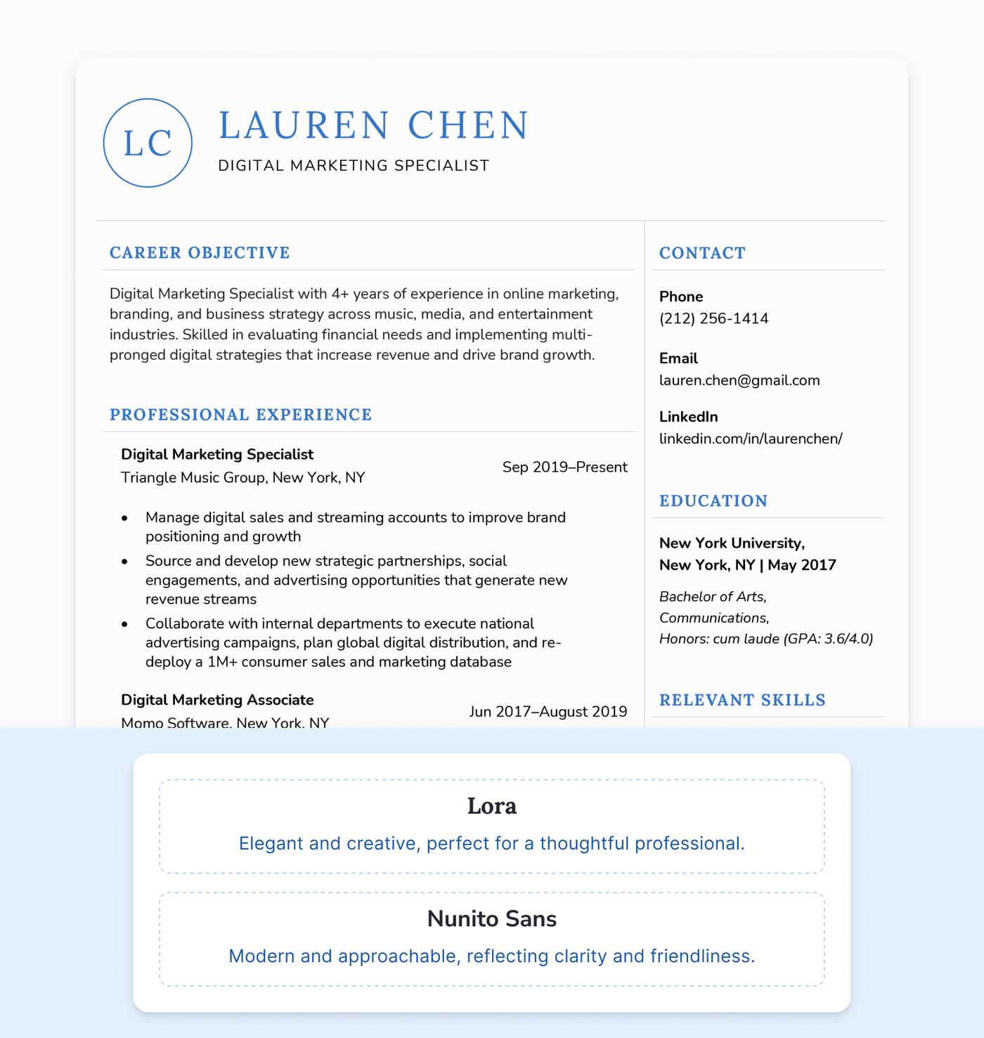
These fonts work together seamlessly to create a sleek, modern look in our Unique template, which also features a simple monogram detail in the header.
2. Josefin Sans and Raleway
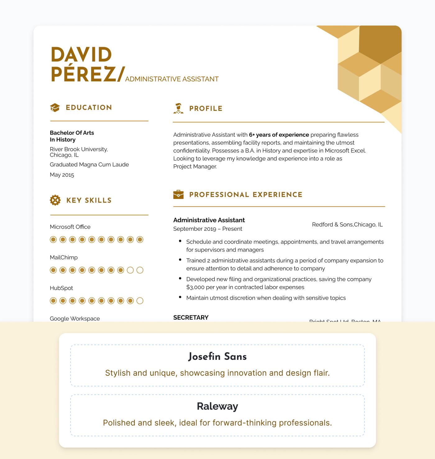
The modern design of our Current template uses clean fonts to balance out the stylized heading. This font pairing is perfect for industries like tech or design.
3. Abel and Open Sans
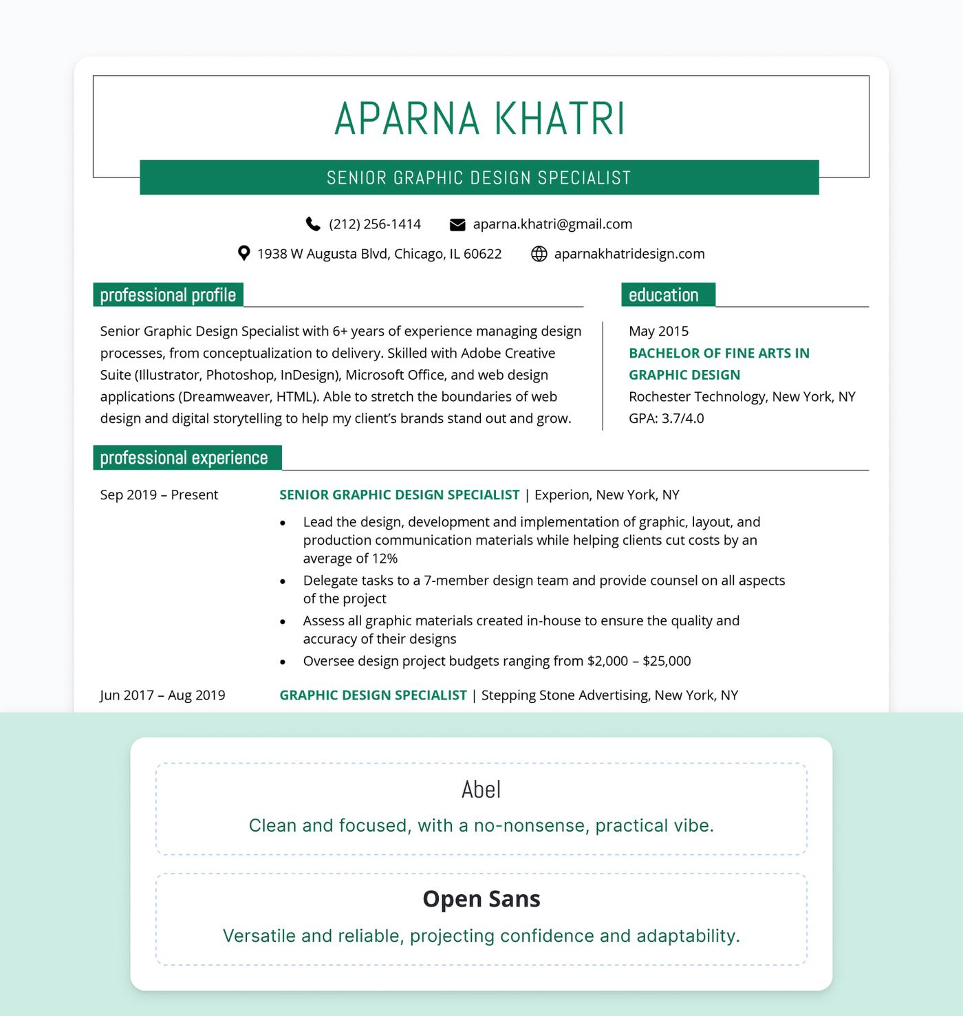
The sleek structure of our Windsor template allows for a more playful heading font while prioritizing readability in the body content.
Frequently asked questions about resume fonts
Here are some commonly asked questions about fonts on resumes:
How do I make sure my resume font is ATS-friendly?
To ensure compatibility with applicant tracking systems (ATS), use standard, widely available fonts like Arial, Calibri, or Times New Roman, as these are easily recognized by ATS.
Stick to clear, readable typefaces and avoid complex formatting or unusual fonts, which can cause parsing errors and potentially exclude your resume from consideration.
Which fonts should I avoid using on my resume?
Avoid using gimmicky fonts like Comic Sans, Brush Script, or Papyrus on your resume, as they appear unprofessional and distract from your content.
Also, steer clear of overly decorative or handwriting-style fonts, as well as extremely thin or hard-to-read options, which can make your resume difficult to read and leave a bad impression on hiring managers.
How can I make my resume stand out without using a crazy font?
To make your resume stand out without using an unconventional font, focus on:
- Making header fonts larger and bolder
- Consistent and clean formatting
- Balanced use of white space
You could also opt for a professional but slightly less common font like Trebuchet MS.
Is it okay to use multiple fonts on my resume?
It’s perfectly fine to use 1–2 fonts on your resume to create a subtle contrast, such as pairing a bold header font with a clean body font. However, avoid using more than two fonts, as that can make your resume appear cluttered and unprofessional.
About the Author

Conrad Benz is a Content Manager and Hiring Manager at Resume Genius. With nearly a decade of experience as a career services professional, Conrad is passionate about helping people navigate the job search process and find fulfilling work.
You can find Conrad’s career insights in publications like Typsy, Resume Library, and more.
Conrad graduated with a B.A. in International Relations from Goucher College in Maryland and currently lives in Taipei, Taiwan, where he helps ensure every article on Resume Genius provides job seekers with the information they need to succeed.
If you want to reach Conrad for a quote or media-related inquiry, you can contact him at [conrad] @ [resumegenius.com].
Click to rate this article
4.9 Average rating